Kentyla Arts Designs | Your Personal Task Force
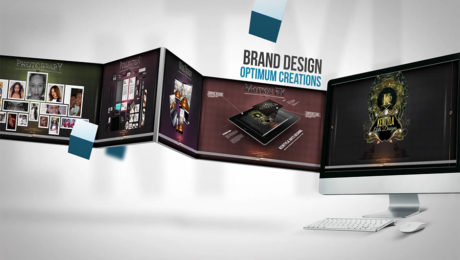
Kentyla Arts Designs (K.A.D.) is an innovative design studio dedicated to providing creative breakthrough solutions that enable our broad-based clientele to elevate their brand. we have substantial experience in Web Design, Multi-Media, Graphic Design and branding. We pride ourselves on developing a close relationship with our clients to ensure we design and produce the optimum product.
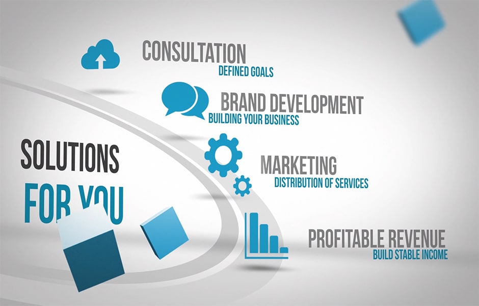
A well established brand name and position is critical in determining longer success and shareholder value. Although financial position, strategic vision, strength of management, and operations are important criteria, ultimately, the strength of the brand name will sustain long-term growth and create opportunity for continued success.
History has proven that being first to market with a product or service which satisfies a consumer’s or client’s needs and develops consumer loyalty is critical. Effective branding and value creation continue to represent the cornerstone of every successful company. In today’s increasingly competitive marketplace for services, retaining a customer’s loyalty is critical. This puts even more emphasis on the need for effective total brand management.
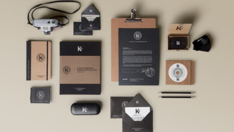
A brand isn’t just a pretty logo, engaging website or strategic marketing plan. It is a deliberate, cohesive message. A story. An idea and connection transformed into an experience. Your brand is an ecosystem powered by all the things you represent – from your core values to the way you interact with your clients to the form and function that exists within your design. Here at Kentyla Arts Designs we understand how to apply the colors and fonts of your logo to your business cards, letterheads and compliments slips in order to create an image your clients will remember.
OUR GOAL IS TO BUILD SOMETHING THAT IS HIGHLY-TARGETED TO YOUR INTENDED AUDIENCES, INTUITIVE, — USEFUL, MAYBE EVEN FUN.
- Published in Marketing, Networking
Why Use Motion Graphics
Why Motion Graphics?
Motion graphics are staging a coup when it comes to communicating the most information possible in just a short time. Content creators and marketers everywhere are embracing the motion graphic as a sort of salve for the ever-shortening attention span of Internet users.
A great deal of video content is created and consumed every day by Internet users – indeed, something like 72 hours of video content is uploaded to YouTube alone every minute. That’s a lot of raw content, but most of us can admit to scrubbing through longer videos to get to the most relevant portions, or quitting altogether if the video goes on a little longer than we’d like.
That’s where motion graphics come in. They condense a great deal of information into a short and visually appealing presentation. They’re a great way to help decrease the risk that a viewer will miss a call to action because they’ve skipped through portions of a longer video.
Here at Kentyla Arts designs, we incorporate motion FX into quite a bit of projects. Simply put, Audiences are engaged more, and for longer periods of time; as opposed to using standard motionless graphics. — Dewwond Mapp
How Are Motion Graphics Created?
Beginning with a static graphics and animating it is easier, as long as you make the right preparations as you create the design. You should create the flat image(s) in vector format if possible, which means that they can be enlarged without any loss in quality. This allows for better control when it comes to animating. For example, when CJ Pony Parts wanted to do some content marketing around the idea of taking a stay-cation, they first had a designer create an infographic on the subject. Since the file was in vector format, it was easy for an animator to take it later and put it in motion.
Starting from scratch will require at least a little bit of forethought and vision. Creating a storyboard, not unlike those used in the creation of feature films, is usually a good idea. You don’t want to have to toss out a bunch of hard work later on if your vision or the needs of your project change along the way. Clarity Way’s recent motion graphic about the effects of bath salts took a lot of work – requiring the collaboration of a researcher, an illustrator, an animator, and a voice-over artist – but it all paid off when The Huffington Post featured it in their Weird News section!
The tools to create motion graphics are readily available, though they may cost a bit. Adobe After Effects and Apple Motion are great choices that make it easy to layer your content and add 3D effects to give the impression of movement. It’s infinitely more appealing to the average viewer than static content.
- Published in Marketing, Networking
The Importance of Quality Logo Design
More than 40 years ago, Nike bought its logo from a college student for $35.
When companies hear that logos can come with such a low price, they often don’t understand why we might charge more than that.
Non-designers also sometimes think that a logo shouldn’t cost much because of its scope — since it’s just one measly design, it should cost way less than, say, a website.
When KAD offers a logo design proposal, we present every option available, but our statement is this:
“You’ll use this logo everywhere.”
Logos are used hundreds — if not thousands — of times. Potential clients must understand that the logo will appear on everything from websites and business cards to email signatures and social media profiles. Depending on the organization or business, the logo could end up on movie screens or billboards, too.
Kentyla Arts Designs is most certain to communicate to potential clients the important fact that, because a logo is so widely used, it’s incredibly valuable. It is not just a simple file.
“It takes time to make the perfect logo.”
People tend to think that a skilled, professional designer should only need a few hours to throw a logo together. Non-design types don’t always understand all the intricacies of a quality logo design.
There are a few reasons logos take a long time.
- A designer should spend some time getting to know a company’s values, goals, and mission to design accordingly.
- Because logos are so important, the revision process is often lengthy — which is expected and OK, but important.
- Finally, the company should want the logo to be pixel-perfect. And perfection takes time.
“It’s more than just one image.”
Some clients seem to think their logo design will come in one 300-pixel square. They don’t always understand that a professional logo design will result in a folder full of different sizes and formats of the image.
Here at KAD, clients are educated and made aware of a list of images they’ll get:
- They’ll receive full-color, one-color, and black-and-white options.
- They’ll get horizontal, vertical, and square designs.
- They’ll get colorful backgrounds and white backgrounds.
- They’ll get images with and without the company name.
- KAD will also throw in a style guide, detailing the specific colors, fonts, and other elements the brand could use in other projects moving forward.
The above list has option packs that do not comprise of all the above. None-the-less, our clients understand that the more quantified the final product, the more value it will appear to have.
“A Brand You Can Trust.”
Our experience will show in our design. And, we have a clear understanding that, clients don’t care about your personal experience — they just care about their logo. However, we will always take the opportunity to explain to them how our expertise will affect their corporate image. Hiring an amateur will result in an amateur-looking logo — which won’t reflect well on their company. On the other hand, hiring an experienced (albeit pricier) professional will give them better results. Ultimately, they’ll look more credible, authoritative, and trustworthy.
“It’s not just an image — it’s a copyright.”
When KAD sends over the final logo design, the client will gain copyright ownership of the image (depending on your agreement). Oftentimes clients are not be well-versed on copyright law. That’s our opportunity to explain the value of ownership. We explain that they’ll have unlimited access — they can use it wherever, forever.
That might not be the case with a less-than-professional (read: cheap) designers. We let them know that the cost of ownership is factored into your fee.
“You get what you pay for.”
Sure, the client could go the way of Nike and purchase a quick $20 logo on some sketchy website or attempt to design their own in Microsoft Word. But there’s a big chance it won’t look as good as a experienced designer could produce.
As a design company, KAD knows more than just how to make something look pretty — we understand how to make a design match your brand’s style and values.
Ultimately, when it comes to logo design, value-based pricing is more important than the time it took to create the design or the complexity of the project. A logo is a company’s identity — it’s invaluable.
Using An App To Enhance Your Business
The Importance of Mobile Apps for Your Business
The customers in today’s world are on the move and they’re using mobile application platforms to get there. Whether they use mobile phones, tablets, or other mobile devices they have all the information they need. That’s why mobile apps are so much important in today’s market.
You need to understand that mobile apps allow customers to have all your information at their fingertips. Also, it is important that your app works on multiple mobile application platforms. But for beginning, start with one platform.
No matter what your business is, a mobile app can help you get and retain customers., and that’s a fact. We all know that the first place customers go to search for a product or service is online. If your business is available online, and plus you have an app that users can download to their devices, your business will make really good impression. At a glance they will be able to see and open your app and purchase from your business.
Here are some of the biggest benefits of mobile apps for businesses. You can:
- build loyalty
- reinforce your brand
- increase your visibility
- increase your accessibility
- increase sell-through
- increase exposure across mobile devices
- connect you with on-the-go consumers
There are more of course. These are just some of the biggest. As you can see, benefits can be huge.
Not only that your business will have benefits, but your customers as well. Here are some of the benefits of mobile apps for your customers. They can:
- easy access to your inventory
- get notifications of special events, launches, etc.
- have one-touch access to your contact information
- get directions to your location from wherever they are
- make fast, seamless appointment scheduling
Until now, it should be really clear – the future of your business depends on your ability to get your business implanted on the phones of customers all around the world. You need to go mobile and be prepared to grow.
Important fact to note: Promotional email messages receive about a 4% read rate. PUSH notifications 97%.
Not only will your mobile app be a cool marketing tool (allowing you to say things like, visit our website to download our free app!) that will help get people returning to your website, but it will allow you to engage with your customers in a whole new way.
The Importance Of Industry Publications
Just over the last few years, countless reasons have been given to explain why print advertising is no longer a sensible marketing investment. First, there was social media marketing. Then there were all of the “bright and shiny objects” that fall under the social media umbrella. Foursquare, the platform that allows you to “check in” to locations, was far more important than print advertising. Then it was Quora, the question and answer platform. Pinterest, Instagram, and now content marketing have all been presented as better investments of time and money than print advertising.
We can’t say that all companies should be investing in print marketing today, just as we can’t say that all companies should be investing in social media marketing today. KAD has worked with a client whose industry is steadily moving away from strong print publications and more towards white papers, webinars, and more. As a rule, however, especially in the Business-to-Business world, we still believe that industry publications are important. Here are a couple of things to consider.
1.)Audited Circulation
Although not all publications are audited, certainly, many key industry publications are. This takes the guesswork out of your company’s media buy. An audit from an auditing company like BPA or AAM (formerly ABC) will not just tell you how many people receive the magazine, but you will also learn the geographic distribution of the audience, what job positions are reached by the publication, and more. This can tell you whether the publication is a good fit for you and can also help you hone your message so that it has the most impact for that specific audience.
2.)People Trust Magazines
Last, but certainly not least, magazines remain credible. On September 23, 2013, Nielsen released a report on marketing trends, including what forms of media were seen as the most credible. The report notes, “Sixty percent of global respondents trusted ads in magazines, an increase of four percentage points from 2007.” Think about that. In the face of social media, content marketing, and all of the hype about how print is dying or dead, people actually have increased their trust in print magazines over the last six years.
As we said at the beginning of this post, print advertising may not be a good match for your company. However, if you are not sure whether print advertising is a good match, our advice is not to dismiss it out of hand just because so many people say print advertising is now “out of fashion.” As with all marketing tactics, do a little research and see what is happening in your industry. You may find that adding print advertising to your 2014 marketing campaign turns out to be a great strategic move!
The Importance Of A Great Website
THE ROLE OF YOUR WEBSITE
In a world where people stay online for most of the day, a standard website just doesn’t cut it. Depending on the product, up to 83% of consumers visit a company’s or service provider’s website before making a purchase. And as more and more consumers make decisions based on their online experience, the appearance, usability, and accessibility of your website is more important than ever, especially if you are in a competitive market.
Having a right understanding of your website’s role can greatly benefit your business. Think of it as an extension of your sales staff. In the same way you wouldn’t send out an unkempt salesman to represent your company, neither should you send out an unremarkable website to the consumer who is specifically searching for your product or service.
Working on a website is the ideal time to consider the rest of your branding as well – message, color palette, and logo. The worst thing you can do is invest in a well-built, mobile friendly website, and not have the proper design elements to make the website stand out visually.
EVALUATING YOUR WEBSITE
We mentioned earlier that your website is an extension of your staff, and just like you formally evaluate your team on a yearly basis, you should be doing the same thing for your website. Recommendations vary, but most agree that every 2-3 years you should consider updating the design of your website. But, you should also be making tweaks to the website throughout the year – offer new information, update pictures, and add any new products, services, or staff members – this is simple, routine maintenance.
Here are a few things to look at when evaluating your website:
- Have you added any services or products?
- Has your target market changed – expanded or tightened?
- Has your competition created a new website or branding that is stronger than yours?
- How do you rank on search engines for the services or products you provide?
- Is your website mobile and tablet compatible?
- Is the overall design up to date, fresh, and current?
- Is it easy for you to make small changes to your website?
If you answered yes to a couple of these, it’s probably time to consider a new website.
NEW TECHNOLOGY
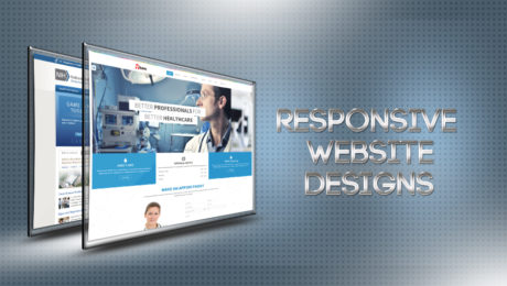
About a year ago a major shift in website design occurred – Responsive Website Design (RWD) arrived. RWD allows your website to automatically resize and reconfigure its layout based on the device it is being viewed on. So, whether your consumer is viewing your website on their desktop, their tablet, or their phone, they are seeing the appropriate version. The reason this is great news is that it has eliminated the need for maintaining two websites – a desktop and a mobile. This cuts costs and saves you time, only having to update one website.
If your current website is not responsive, you should consider the potential downside to this. Over the last year, the percentage of traffic to websites via mobile devices has increased by 78%. As of quarter one of 2013, nearly 25% of all website traffic is derived from mobile devices. If your website is not mobile friendly or compatible, you are potentially losing out on 1 out of every 4 consumers. 2013 has been called the Year of Responsive Web Design.
Another feature, though not quite as new, is Content Management System Websites (CMS). These websites use a platform that allows the owner to easily make changes to the website without any software – just an internet browser. The days of relying on your web developer to make every little change to your website are over, which is great news. This means keeping your website fresh and up to date with current information is easier than ever.
If you are considering a new website, these are the first two questions you should ask the web developer – will it be responsive and will it be built with a CMS?
SEARCH ENGINE OPTIMIZATION
With over 650 million websites, and another 51 million added each year, there is plenty of online competition for your services. We looked at a few ways to make your website stand out aesthetically, but there are also ways to help it stand out on search engines. Being on the first page of a Google search for your services is crucial to your online conversions.
Search Engine Optimization (SEO) is what helps your website rank well with search engines. There are several SEO services that can be performed on your website, both one time and ongoing. This is another factor you should consider when building a website; much of the SEO work is done during the website build, so be sure to ask early. This is a much larger topic and one we may revisit in a future article.
THESE DAYS, IT’S LIKE A BUSINESS CARD
Having a business card has been necessary for years and years. Websites have become just as necessary. It’s expected and it has become a major component to the consumer’s decision process. Even if they learn about your company through a trusted referral, at a sponsored event, or in a meeting with you, before they make a final decision they will visit your website. Make sure it looks good, functions well, and clearly communicates your company’s goals.
KAD Black Gold Logo
This particular project was created with a combined group of programs. Adobe Photoshop, After Effects, and Illustrator helped me to create a polished logo animations for clients. I incorporate Keyframe Assistant to build animations with multiple repeating elements, and animate with color, starting with grayscale values you’ll use to generate different hues.
This graphic logo was created and produced by Kentyla Arts Designs. We’re honored to host this content in our library.
- Optimizing bitmap and vector logos
- Repeating animation with the Keyframe Assistant
- Animating with colors
- Animating type logos
- Building and saving transitional elements
- Rendering your animation
The public is more familiar with bad design than good design. It is, in effect, conditioned to prefer bad design, because that is what it lives with. The new becomes threatening, the old reassuring. -Paul Rand
- Published in Motion Graphics
SER Central States 10k Race
This event was very special to me because it was facilitated by SER Central States. A community organization that promotes economic, self-sufficiency, and upward mobility for low-income community residents through education and employment. I was called in by a close friend to shoot the event. (Brent Johnson). Mr. Johnson is one of the superior young supervisors/mentors that SER employs.
Brent Johnson is one of those individuals who strongly believes in our youth. He spends countless hours making sure that the youth have a responsible and reliable person in their corner. He prepares them for job interviews. He helps them with schooling. He instills in them the fundamentals of self-worth, respect, and dignity.
I believe in our youth. Our tomorrow rest in their hands. In the society that we live in, they face very tough odds. I, and others like me, represent the village of support that’s needed in terms of taking a leadership stand for these young people. If the guidance and support is not there, their future is certainly dim. And, I refuse to let that happen. Not on my watch. –Brent Johnson
SER Central State employs a host of personnel who genuinely care for the youth. So, when I was asked to photograph these youth giving back to our community, I was delighted to do so. They did a magnificent job hosting the runners of the 10K Breast Cancer Awareness fundraiser.
- Published in Motion Graphics, Photography
5 Desirable Qualities Every Good Photographer Should Have

So what makes a good photographer? It depends on what photography niche you’re in. Every niche demands different desirable qualities—pet photographers need to know how to properly interact and connect with animals; sports photographers need to be quick, strong, and agile to get the best shots; and so on.
But, of course, some of these qualities will always overlap.
Here are five desirable qualities every good photographer should have:
1. Creativity and Imagination
Photography, for all intents and purposes, is a form of art. Therefore, it requires a creative mind—and plenty of imagination. A good photographer must be able to look at something ordinary, or even extraordinary, and find a million different ways to interpret what he’s seeing and convey those interpretations in beautiful and meaningful photos.
As you may have already heard, a composition is everything in photography. Even if you aren’t concerned about the artistic side of your craft, the composition is still key in producing good photographs. Sure, some basic composition rules can guide you, but at the end of the day, creativity and imagination are the best guides for stellar compositions.
2. An Eye for Detail
A good photographer must have a very keen eye for detail to ensure that all elements within the photo—the lighting, the composition, the subject, and everything else in between—work together harmoniously to convey the right vision or message.
Key elements that make up a photograph:
- Lighting
- Composition
- Storytelling
- Emotion
Even the tiniest detail can make or break a photograph. So having an eye for detail, and being meticulous when scrutinizing every single element to ensure cohesiveness, is very important in producing the perfect photograph.
3. Patience and Flexibility
No matter how much you try to control every variable, things just won’t go your way at times. There will be days when the lighting won’t cooperate, when your models or clients will be exceptionally difficult, or when your camera just won’t give you the desired results.
And of course, there will be times when you’ll have to take a billion photos just to get one perfect photo.
Whatever photography field you may be in, patience (lots of it) is always an essential quality to have. You need to be patient enough to wait for the perfect lighting. You need to be patient enough to deal with crying babies, hyperactive animals, and difficult clients. And most of all, you need to be patient enough to keep trying when you simply can’t get the right shot.
In addition to patience, you also need to be flexible. The two qualities go hand in hand—you need to be patient enough to deal with whatever comes your way, and you need to be flexible enough to make the best of undesirable conditions.
4. Good People Skills
Being a professional photographer means working with people—whether it’s a client, a model, or even a fellow photographer. Thus, being a good photographer requires good people skills. You’ll also need to network to obtain clients and partnerships, so knowing how to connect and communicate effectively with others is imperative.
When you’re photographing people, knowing how to take a good photo simply isn’t enough. You also have to know how to interact with your subjects to make them feel at ease, get them to cooperate, or draw out all the right emotions out of them.
5. Passion
What sets a good photographer apart from the rest? Passion.
When you’re passionate about what you do, it will always shine through in your work. It takes a lot of time and effort to make it as a professional photographer, and the ones who do succeed and manage to make a name for themselves are those who are truly passionate about their craft.
Passion makes the photographer—it will always make you work a little harder, push a little farther, and strive to be better than you were the day before.
- Published in Blog
- 1
- 2


